Cully: Facebook Messenger Movie Bot
Project Summary
The Cully project is a government funded innovation project for us to create a product that uses newer technology to innovate. I joined the project in the early stages at that time we were making a chatbot that recommended events to people based on their interests. The first release of the chatbot was specifically for finding interesting events in your city (beta only had Toronto and Vancouver). This gave us some experience with launching a bot on Facebook Messenger and getting some initial usability and product feedback. It also helped me define what was working and not working in my design process.
Once we got our first chatbot out of the door we began to pivot our focus to the movie theatre industry. We saw an opportunity to help simplify the ticket buying process and provide an easier guided experience for moviegoers.
My Role
Product Design, Product Management
The Team
1 Senior Developer, 1 Intermediate Developer
Tools I Used
Sketch, Sketch Plugin: User Flows, InvisionApp, GitHub, Dialogflow, ChatFuel
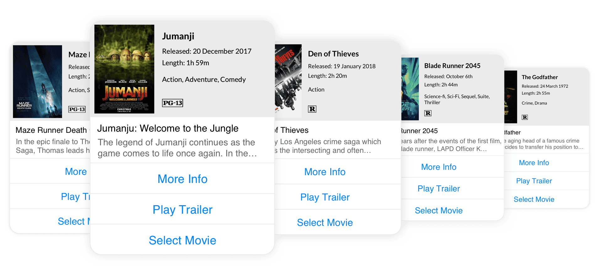
Above is an example of our movie theatre chatbot experience. We’re still testing and making changes as we go but so far the response from our testers and partners has been very positive. For certain tasks, people seem to really appreciate the use of a chatbot. We started using Google’s Dialog Flow to create a better chat experience that leverages natural language processing. Using this technology will allow us to easily take our bot to the next level using voice assistants such as Google Home and Alexa.
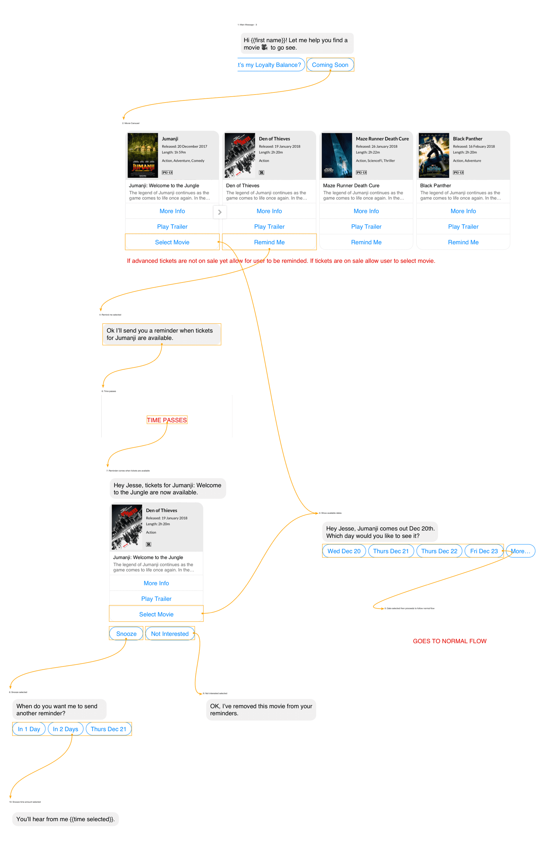
There were lots of differences working with bots vs working With web applications but I still feel like most of my UX knowledge transcended the medium. The main parts of my workflow that I had to adapt to in this new scenario were IA documentation and prototypes. Instead of using traditional sitemap documents I relied heavily on mapping out the flows and showing snippets of the conversations. This gave the team a really clear understanding of what we needed to build and how each decision would affect the flow.
Prototyping was the other area I needed to make some changes to. No longer could I create an HTML prototype or stitch together some screens within InvisionApp. I needed to be able to preview exactly how the experience would be for the end users. This is where I found ChatFuel to be extremely useful. Chatfuel turned out to be a great prototyping tool where I could build actual flows in their software and push them to my Facebook Messenger test account. Instantly my chat prototypes were pushed out to Messenger and I could interact with them exactly as an end user would with our final product.
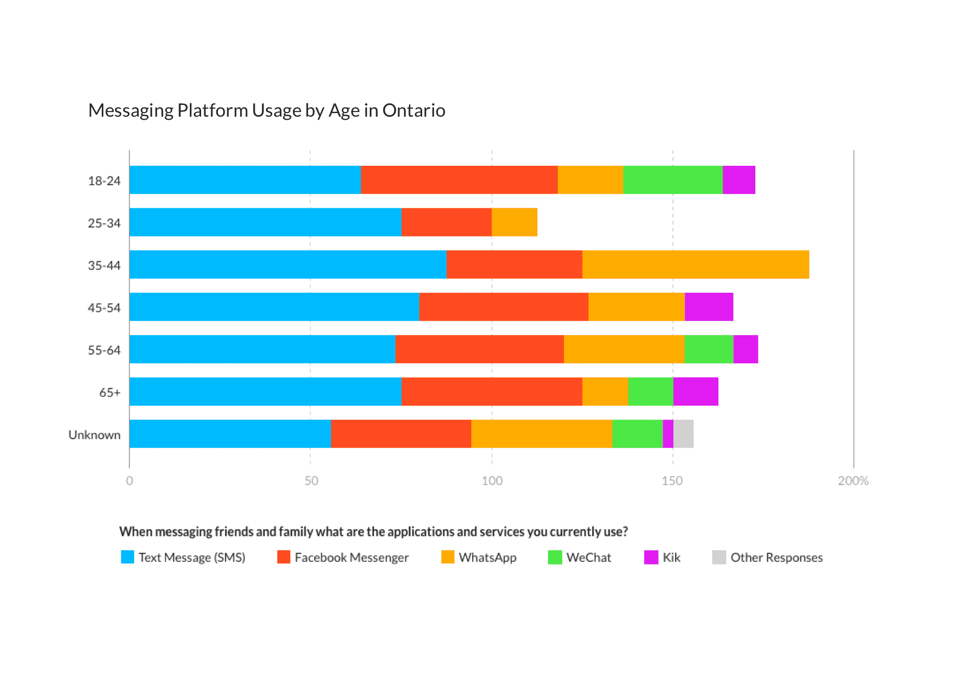
If you would like to learn more about this research you can checkout the full blog post here.
Some of the tools I used to conduct research for this project were:
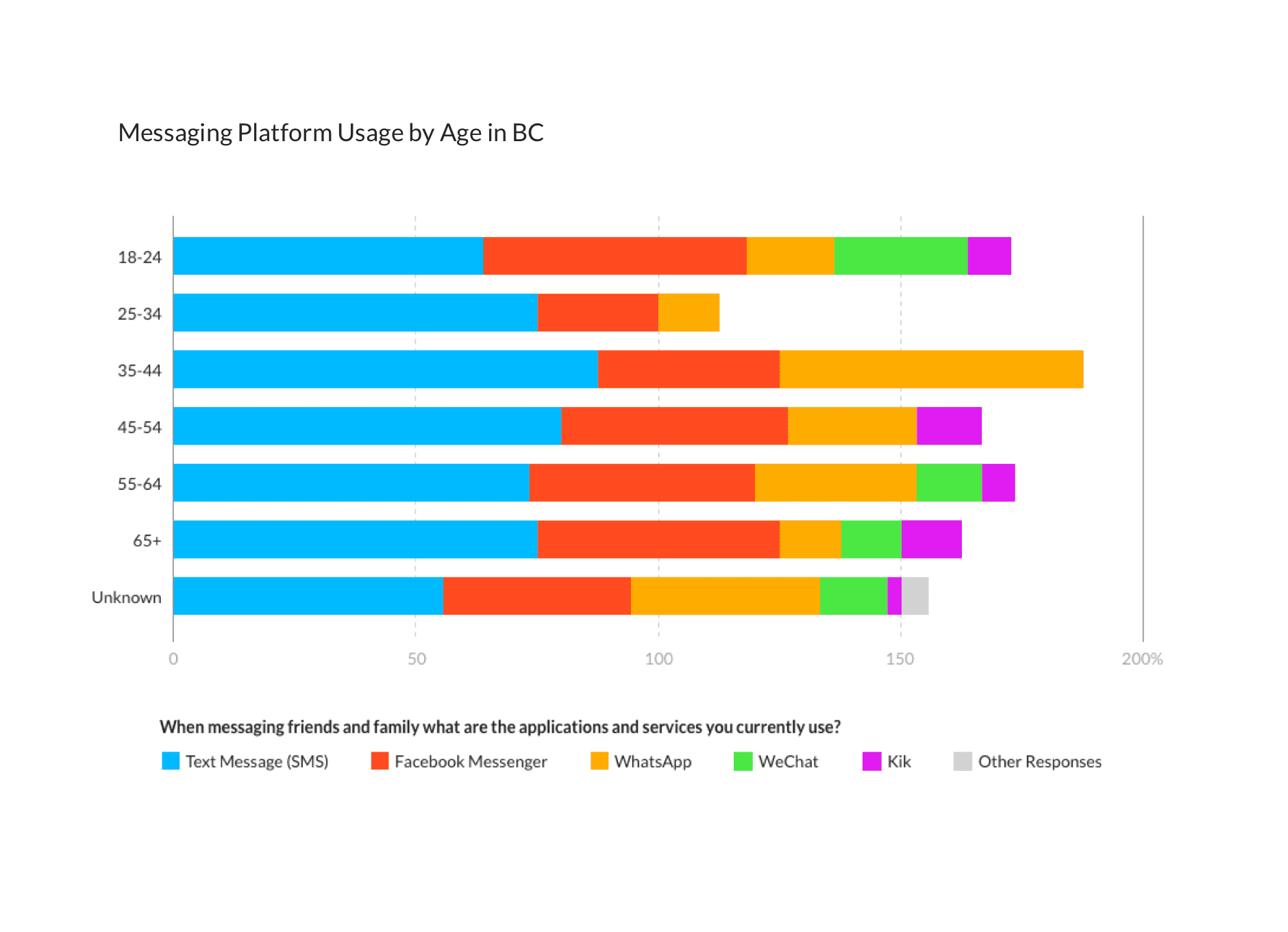
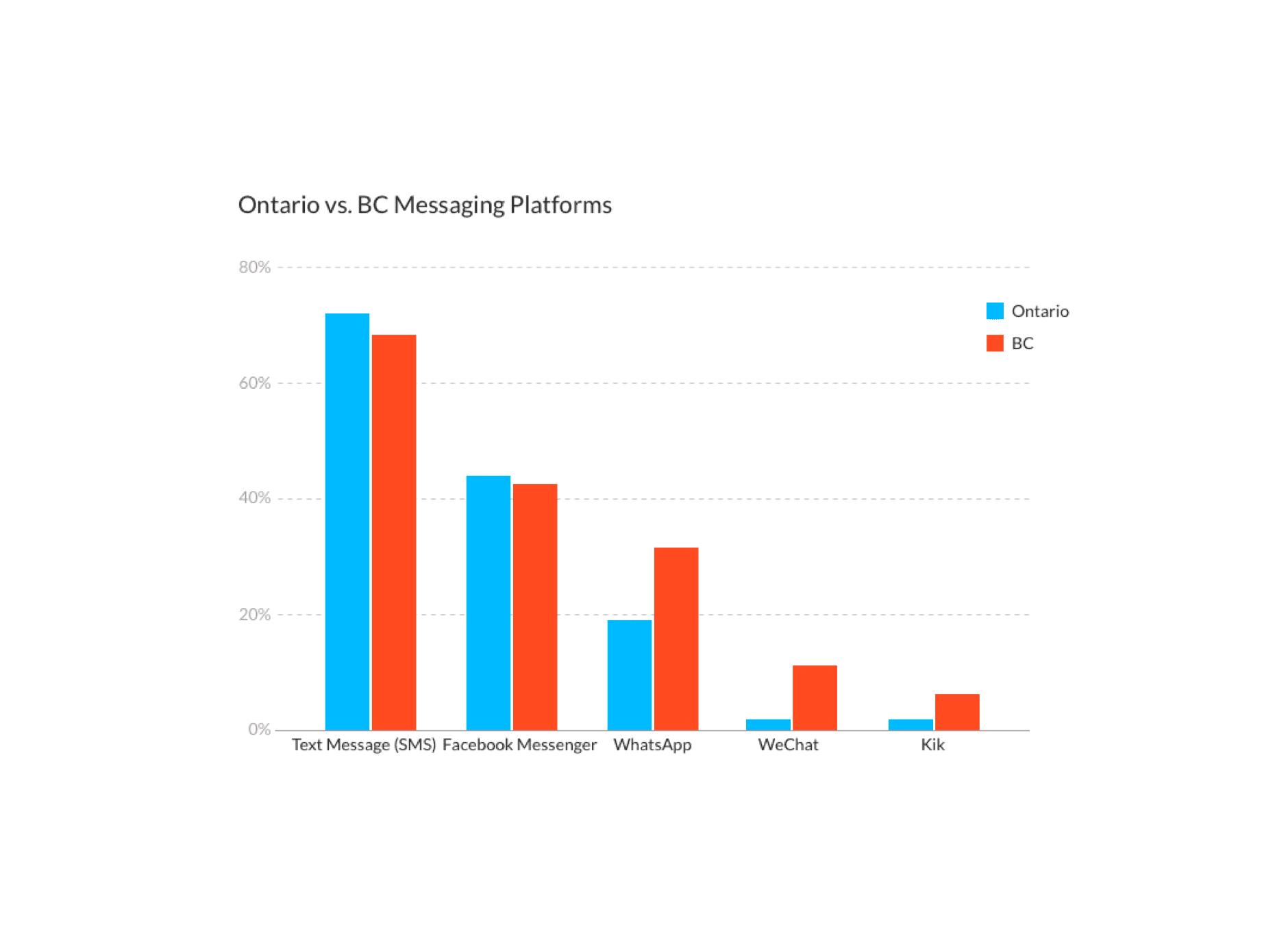
Paid Surveys: we used Google surveys to conduct some preliminary quantitative research. This helped with getting a grasp on the general publics' knowledge of chatbots and which chat platforms they used most.
Free Surveys: Similar to the above except we reached out to our network and had a chance to have more of a dialog with them.
Post Use Survey: Once people tried out the bot for a few days we followed up with a survey asking them about their experience.
Session Reviews: Since we can see and read all of the conversations we had a great opportunity to analyze the conversations and find any stumbling points our users were facing.
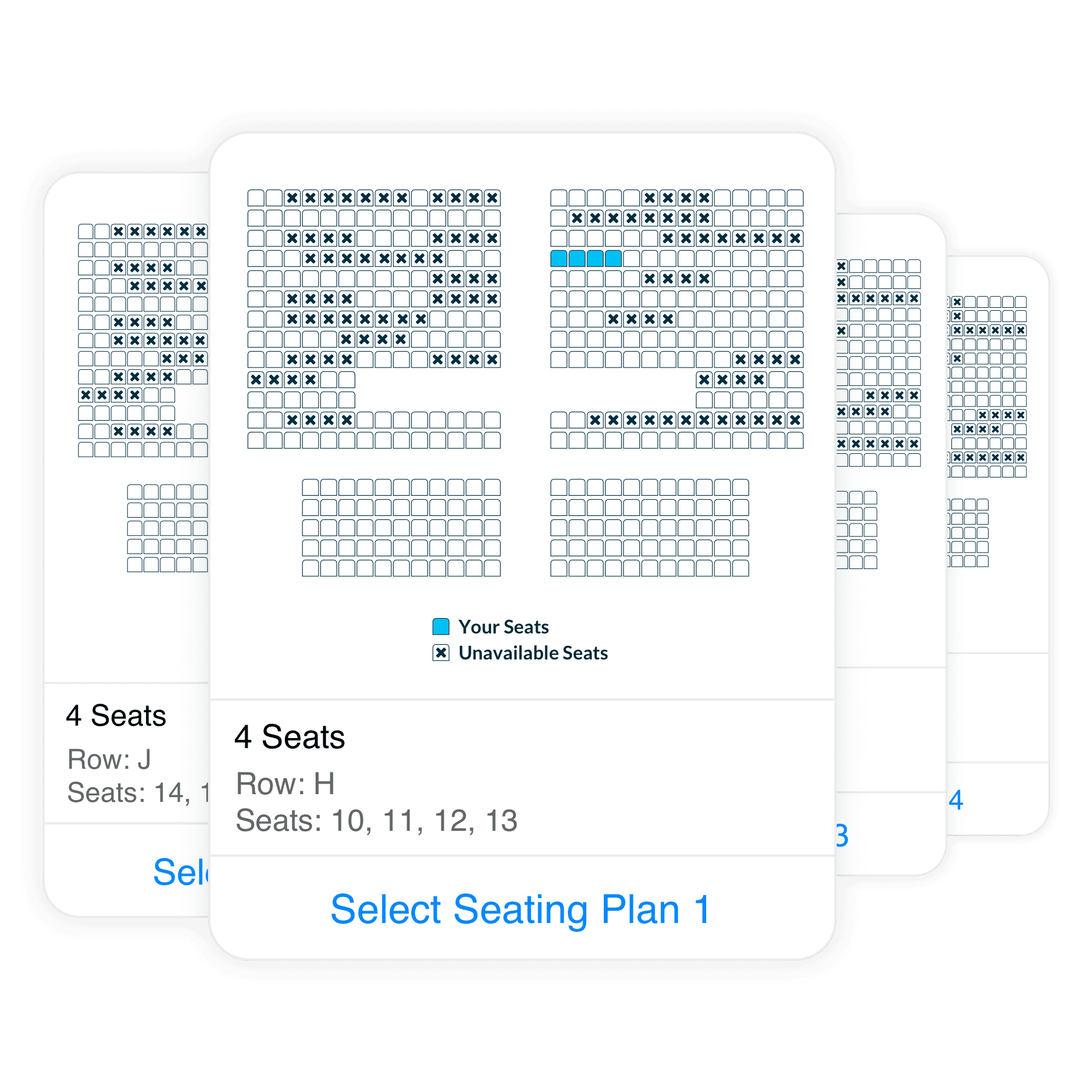
This is a sample of how we tackled seating selection. Instead of opening another web UI for the user we managed to keep them within Messenger but placing a variety of seating options within a carousel (Messenger UI). The user could see a variety of seating options and select the plan that works best for them.
Unfortunately, I cannot dive into too much detail about how we’re productizing our chat platform. However, we are working with an international partner that will be white-labeling our solution and helping sell it to theatre chains all over the world.

