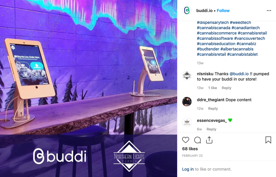
Buddi In-Store Kiosk
Project Summary
I'm a founding member of the Buddi team. Over the past couple of years, I've been leading the design and development of the platform. Our product helps retailers improve store efficiency and easily relay product information to their customers via an in-store kiosk. We started this project near the end of 2017 and in June of 2018, we began working on it full-time. It's now being used in 200 recreational cannabis stores nationwide.
My Role
Product Design, Product Management, Front-End Development
The Team
CEO (Sales), 1 Remote Developer, 1 Remote DevOps Engineer
Tools I Used
Figma, InvisionApp, FramerX, VS Code, HTML, CSS, Javascript, VueJS, Laravel, GitHub
The Origin Story
In mid-2017 Ryan and I met at a hackathon for design and business called Protohack. We spent the day putting together the concept for the application and preparing the presentation to the panel of judges. Our presentation was well received and we placed first in that competition, this win helped propel the idea and allow us to take it to the next level.
Throughout the rest of 2017 and early 2018, we created concepts and validated them with our market. From the feedback, we collected, we began working on the product that you see today. The 2017 version is much different than the version you'll see today. In 2017 we were very focused on the medical market and helping match customers with products based on their preferences. However, we saw a bigger opportunity in the legal recreational market to help share product information with customers and help stores with small profit margins increase their operational efficiency.
Retailer Challenges
- Customers cannot interact with products (not allowed to see, smell or touch) as per the government regulations.
- Retailers carry over 300 SKUs at any given time which makes for a difficult buying decision. Paper menus become outdated quickly and menu boards cannot contain all of the various products.
- There is a lack of product information, customers have to spend time figuring out what they want before coming into a retailer.
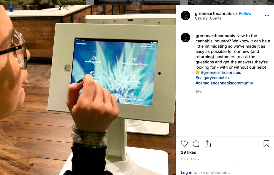
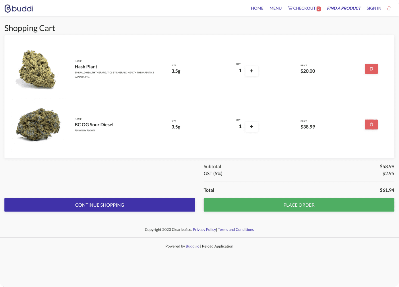
Buddi for Retail is an in-store kiosk that allows customers to browse a retailers entire inventory and build a shopping cart.
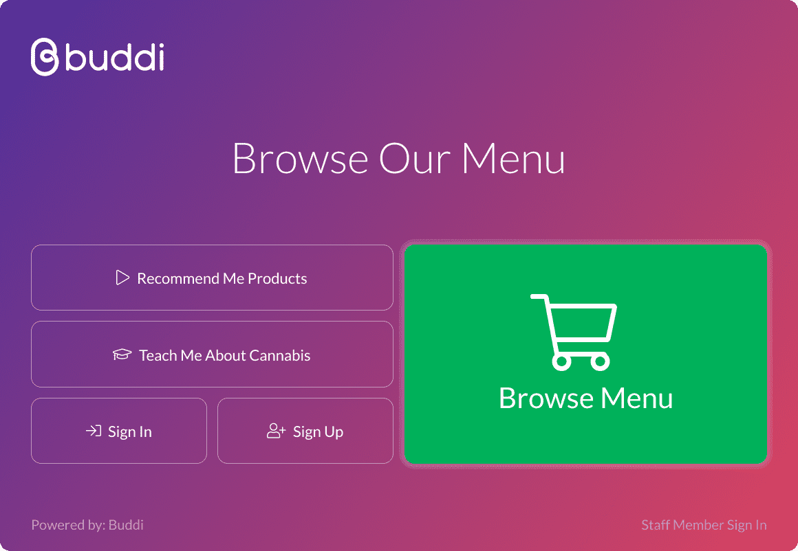
This is the welcome screen, the first screen customers interact with.
Normally, it's branded to match the store.
A Few Key Features
- Point of sale integrations: these allow for retailer menus to be automatically synced and updated. It also enabled customers' orders to be placed on our kiosks and sent as a parked order to the POS system.
- Product content management: we have a team managing the product content for retailers so that they don't have to worry about sourcing great images and descriptions. Our teams work directly with licensed producers to obtain this information.
- White labeling and custom branding: we allow for retailers to brand this system as their own to help make their in-store experience feel cohesive.
- Customer queue and order board: our customer queue allows for fulfillment teams in the back to see incoming orders and use our workflow to find those products and prepare orders. This connects with our in-store order board feature the informs customers of where their order sits in the process (similar to the McDonalds kiosk).
A screen recording of the in-store Buddi Kiosk showing some of the interactions customers can make.
My Design Process
For this type of project, it's crucial that a lean UX design method is used. As a startup, we needed to efficiently manage our expenses. It was important that the time going into design and development had a strong rationale, new features or enhancements should have demand.
From our 2017-2018 earlier prototype, we had gained a lot of crucial feedback from clients which helped shape the updates we made and direction we took as a business from mid-2018 until now.
For each new feature, we would come up with a concept and internally validate that with our team and also with a team of retailers that were willing to collaborate with us. Once we had a clear idea of what was working and not working we proceeded to our next step of creating interactive prototypes to help flesh out the flow. We then shared our prototype externally and learned from watching people interact with it. These learnings helped us with our next iterations and allowed us to proceed into development.
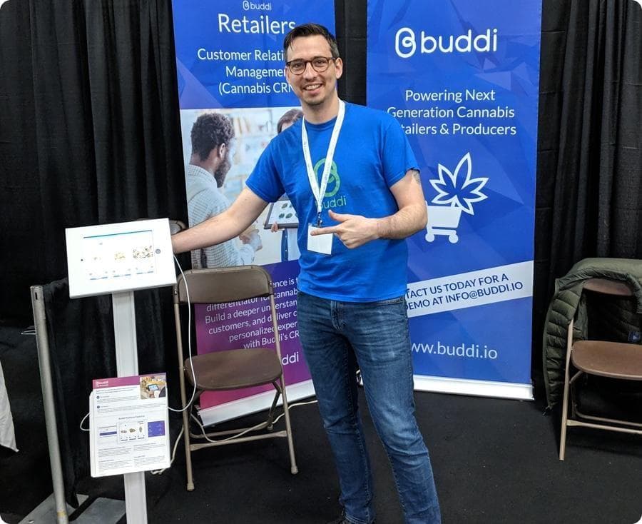
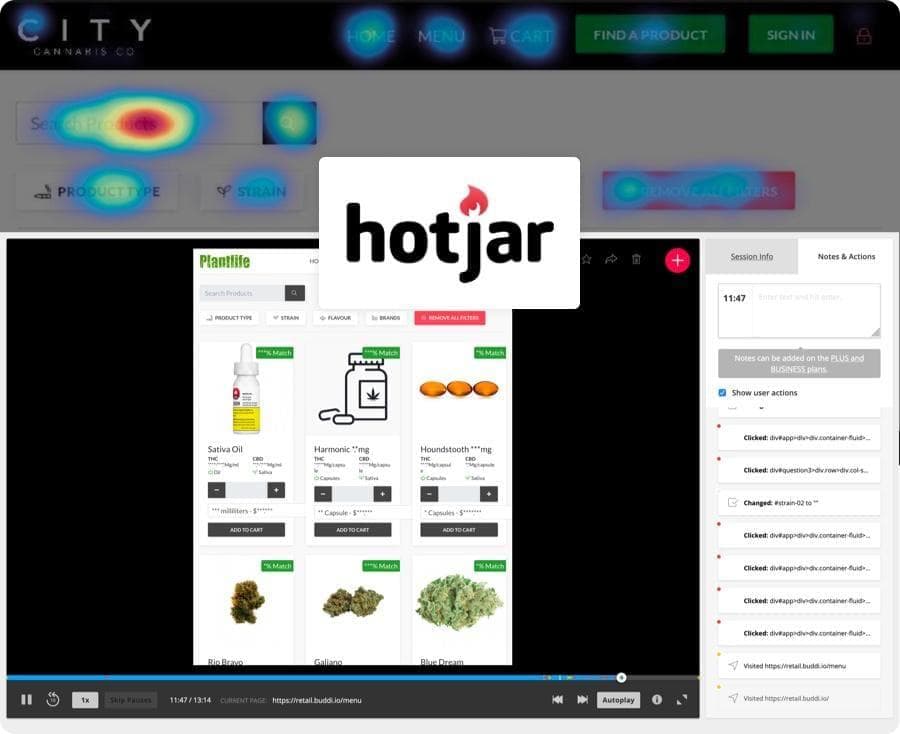
Going to trade shows watching people interact with the platform is a great way to gain feedback.
Listening to Our Clients
Since we were a small team many of our feature ideas came from our clients early on. We had clients actively using the platform that would be more than happy to share ideas with us. We were very accommodating with building these requests as we knew many of them were applicable to all of our clients.
"It's difficult for our staff members to type in their login to the platform, is there a way we can simplify this for them?" - We implemented a quick feature that listed staff members, allowed them to select who they were and enter a short password. We didn't need the typical security of a email/password sign in since they were already signed into the retail stores account.
"Some of our customers don't know where to go after they've placed an order on our Kiosk. We have a special register that they should visit." - To help with this we allowed retailers to enter their own custom checkout message that helped them direct the customer to the appropriate area of the store.
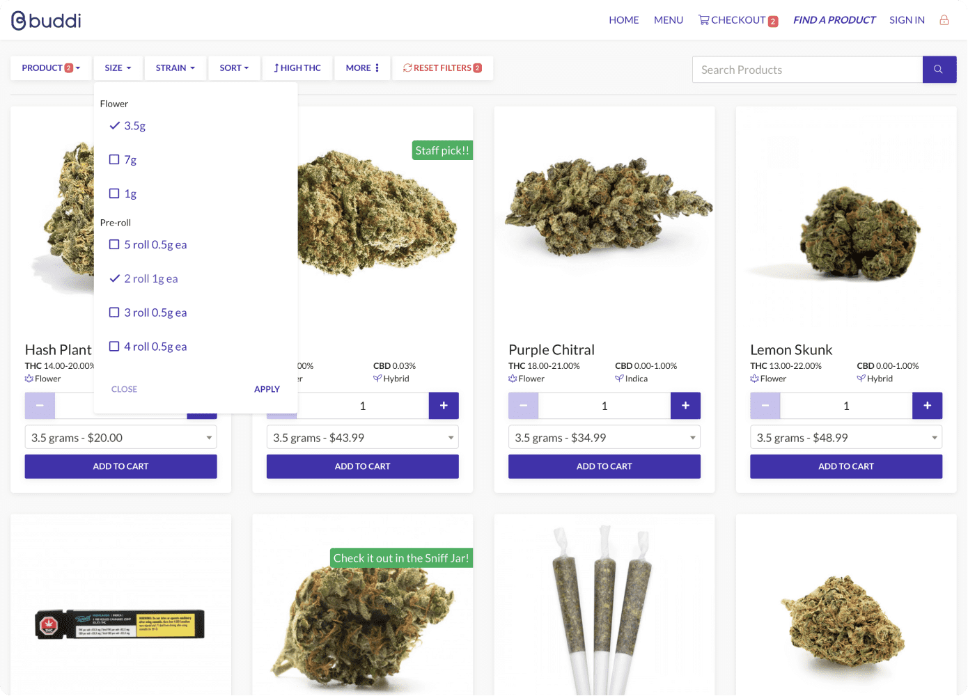
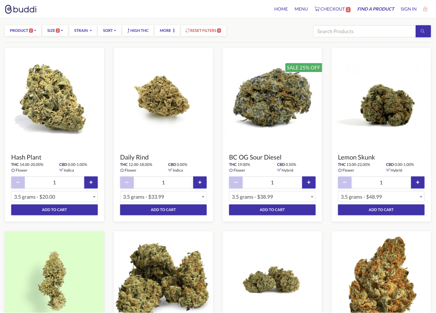
200
Retailers nationwide
6,500
Avg products sold a day
40%
Larger baskets when using Buddi
The Challenges
Being a smaller company we didn't have the resources to expand our development team. Our developers on the application are back-end focused but we're developing an application that is consumer-focused, easy to use, and pleasant on the eyes. I had to step out of my comfort zone and learn as much as I could about front-end development and design. I took on the task of developing my designs into functioning code, I'd committed these to the git repository and worked with the development team to make sure they are as close to what I envisioned as possible. At times this meant I had to sacrifice the exact design I wanted to be able to develop something quickly and get it into the hands of our customers. However, this worked well with our lean UX model and allowed me to focus on iterating the areas of the product that needed the most help based on our interactions with customers.
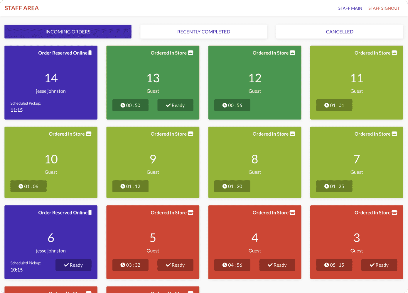
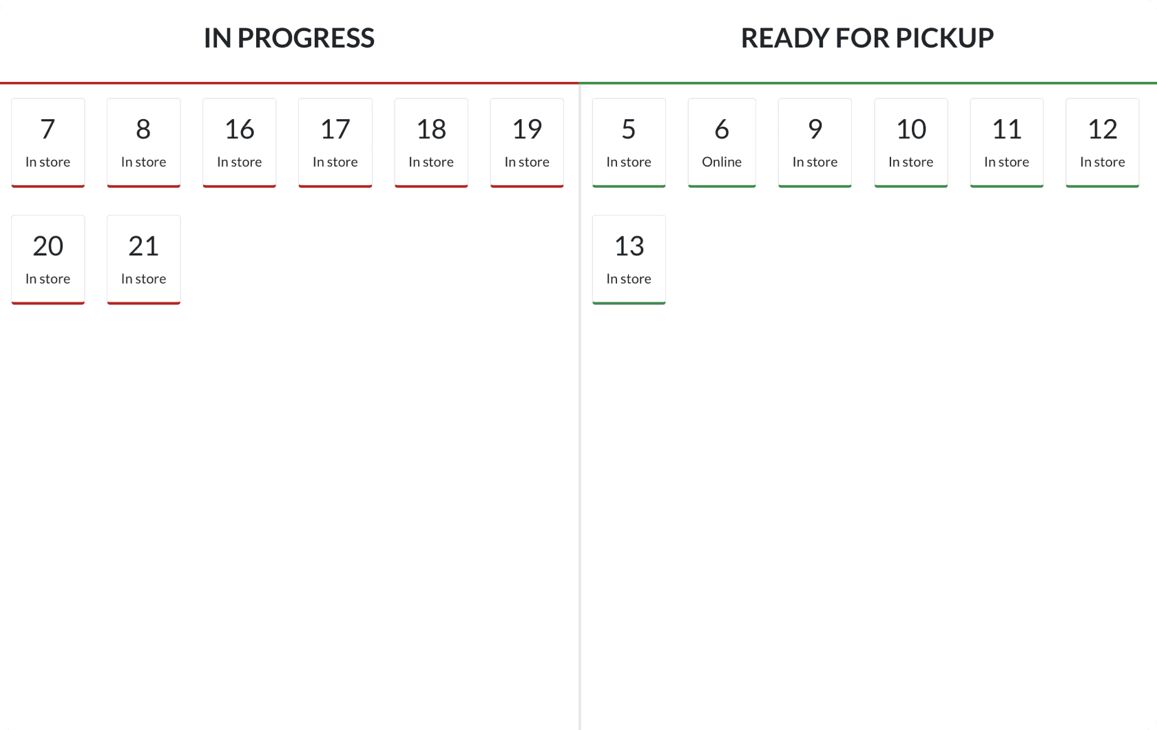
This is our in-store order board. It helps keep the customer updated on their order status.
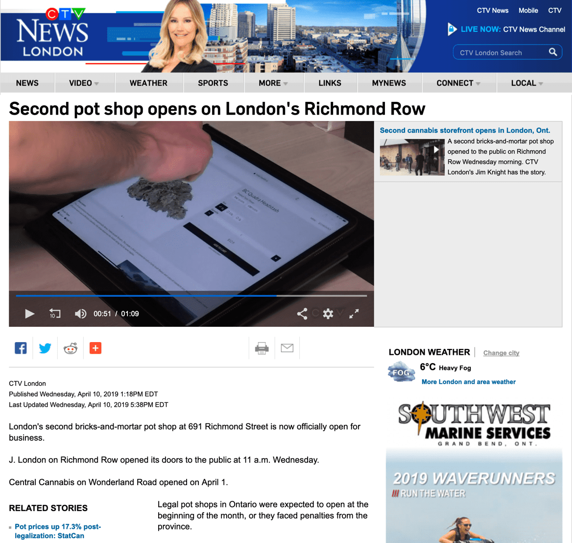
Our application is being used all across Canada in legal recreational cannabis stores.
The Reception
In January of 2019, we had a handful of retailers using the platform and by the end of the year, we had over 180 stores. Now as of mid-March 2020 we have over 200 stores actively using our platform. For some stores, we become a critical part of their operations strategy and we help them run an efficient store providing a create customer experience.
Our application was a runner up for the Vancouver UX awards in the category of e-commerce (although technically we're not e-commerce it was the closest category match).

